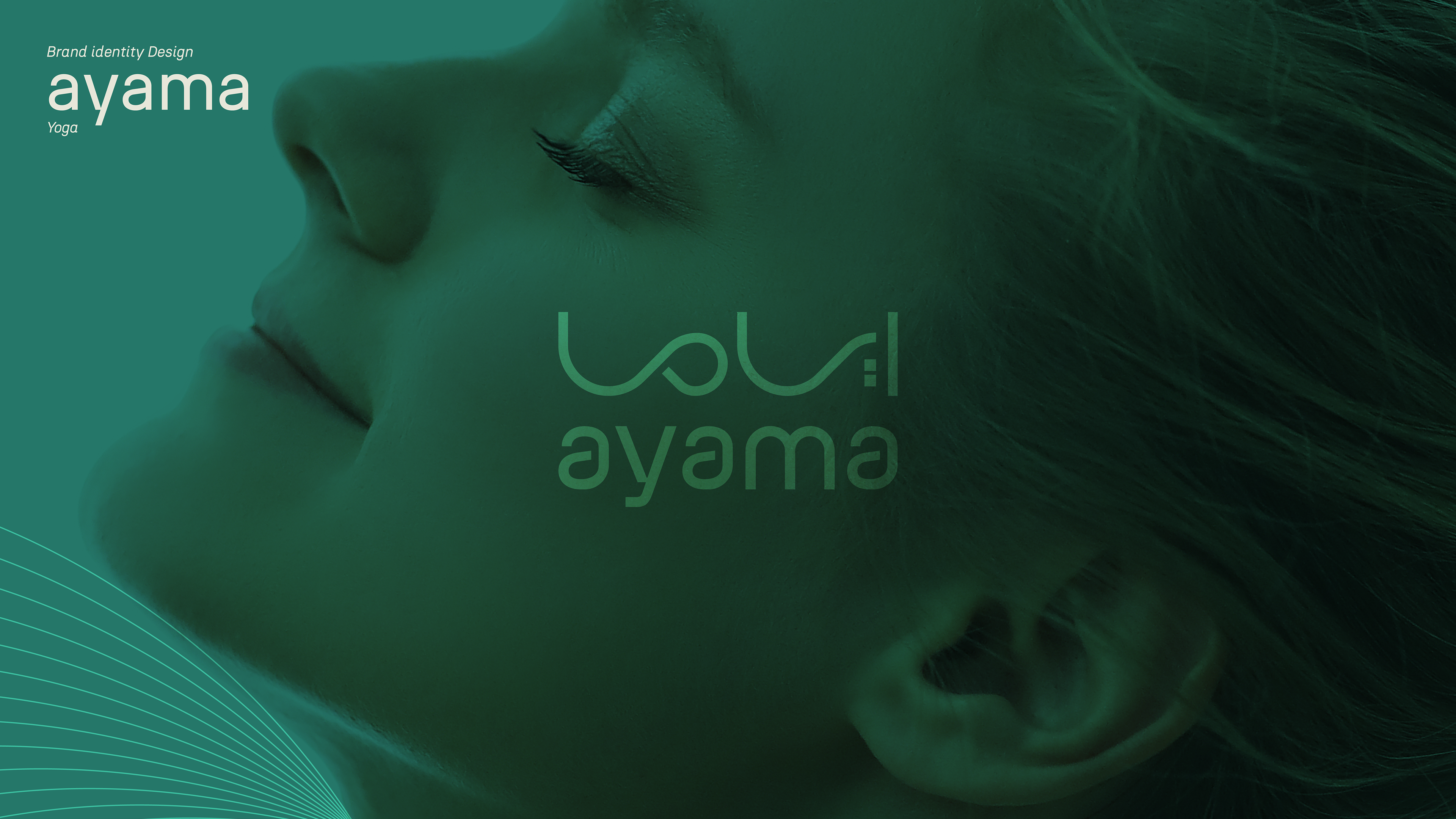
اياما
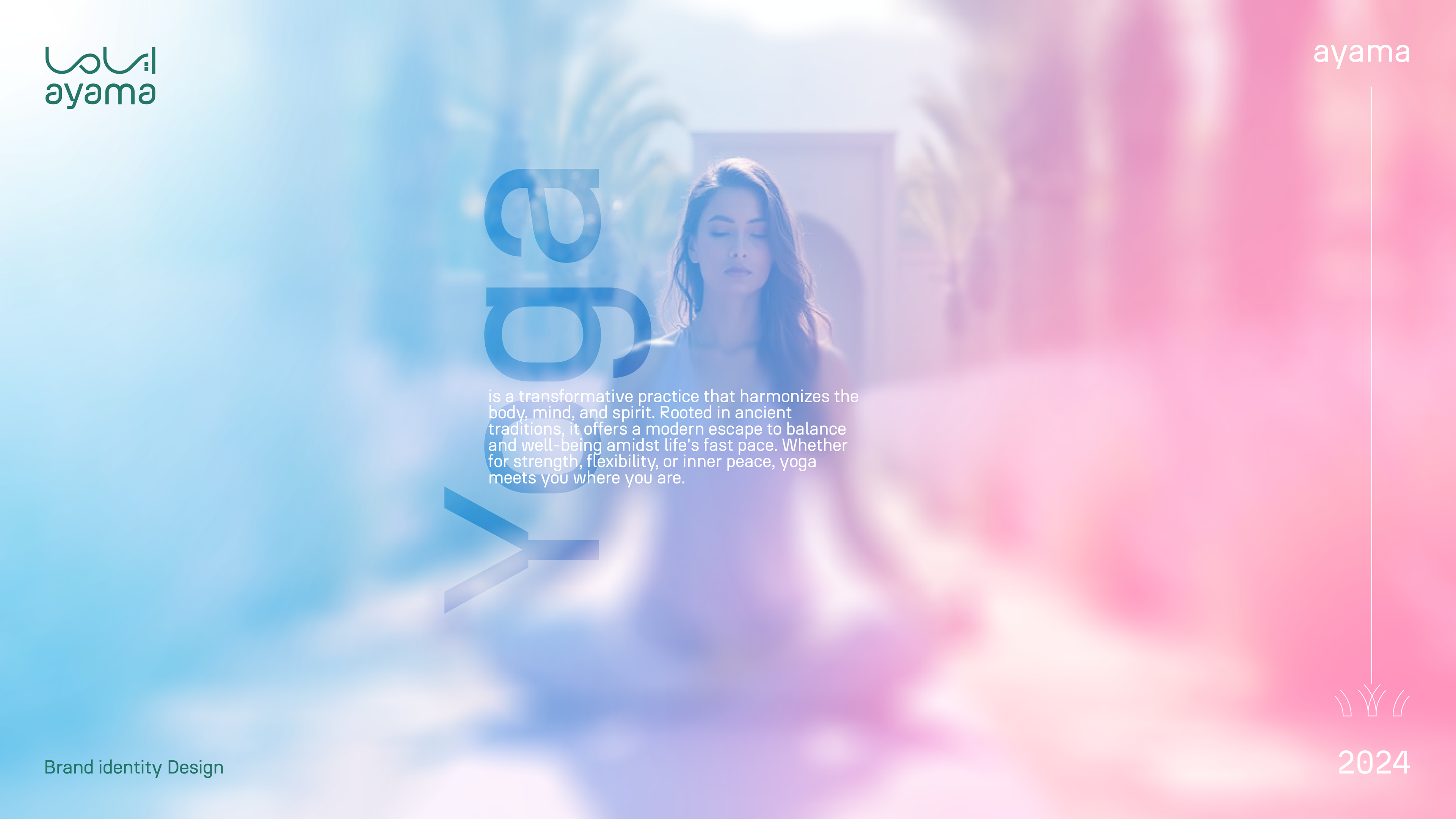
معنى الاسم (Pranayama): "أياما" مستوحى من كلمة سنسكريتية عميقة المعنى وهي Pranayama، التي تعني "توسيع الحياة". في سياق علم اليوغا، تشير الكلمة إلى تقنيات التنفس التي تهدف إلى إطالة قوة الحياة الحيوية (Prana) في جميع أنحاء الجسم من خلال التحكم في النفس (Ayama).
في فلسفة اليوغا، التنفس ليس مجرد وظيفة جسدية، بل هو بوابة للوعي العميق. يبدأ الاتصال بالجزء الروحي من الإنسان من خلال التنفس؛ فـ"البرانا" هي طاقة الحياة، و"ياما" هو التحكم أو التوقف المؤقت للنفس، مما يخلق مساحة لاستقبال المزيد من الطاقة الحيوية وتعزيز الاتصال الداخلي.
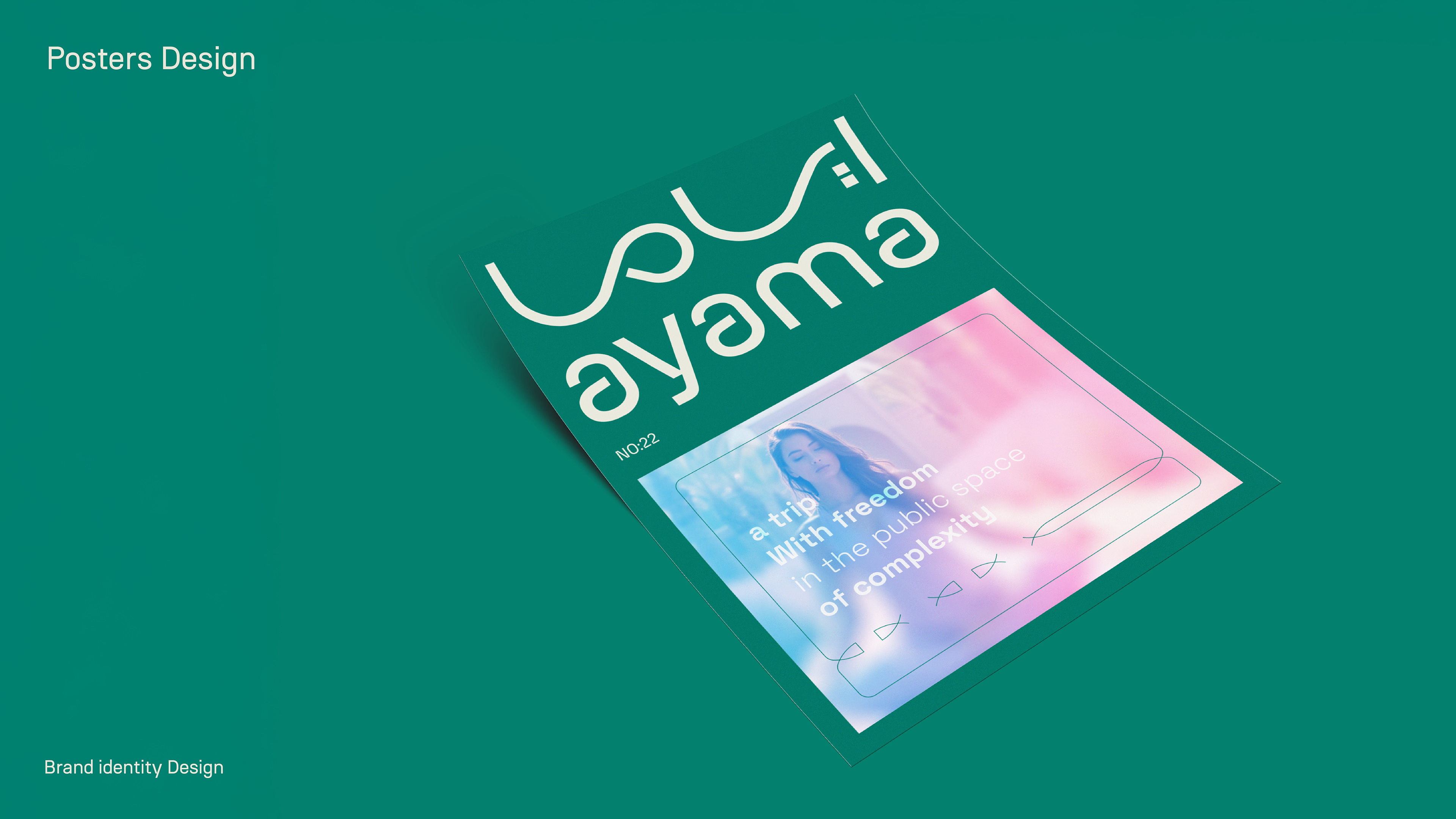
دورنا في تصميم الهوية:
كان دورنا يتمحور حول إيجاد متنفس بصري يُترجم ماهية المشروع ويعزز رسالته. من خلال الهوية البصرية، سعينا إلى التعبير عن توجه البراند نحو الراحة والسكون.
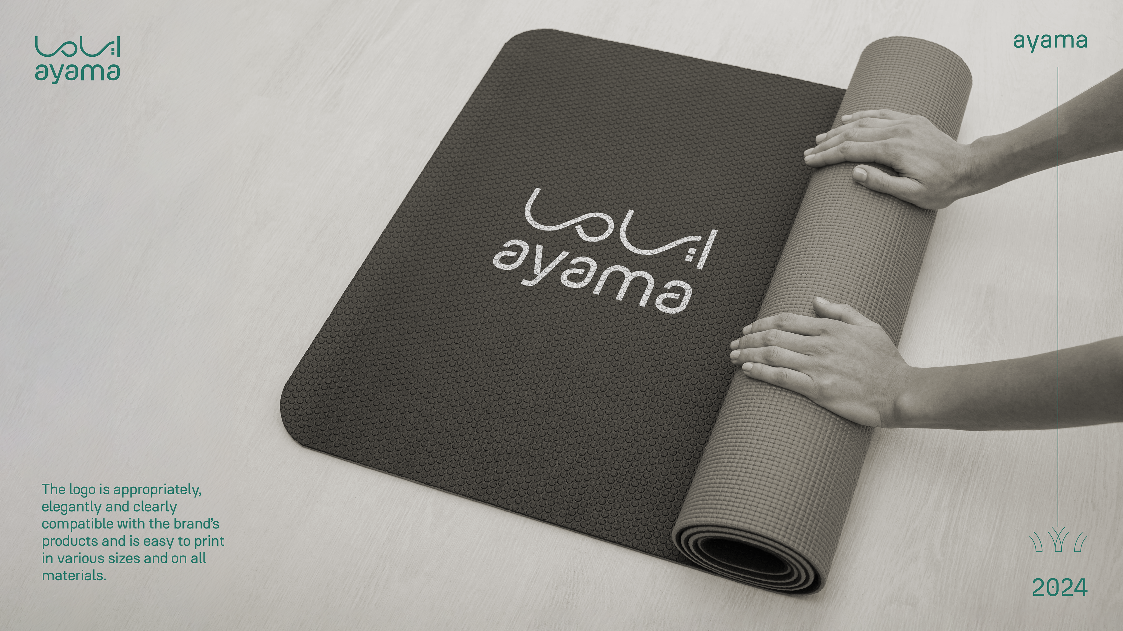
تم تصميم نمط لوني وبصري يُبرز هدف المشروع ويحل مشكلة العميل في إيصال فكرته. شملت العملية تصميم العلامة التجارية، اختيار الألوان المناسبة، وتطبيق التوجه البصري في المواد المطبوعة والبيئة المحيطة.
لقد كانت رؤيتنا قائمة على تقديم هوية بصرية تُشعر العميل بالارتياح وتعكس جوهر المشروع بكل تفاصيله، لتكون أياما علامة تحمل رسالة السكينة والاتزان في عالم مزدحم بالصخب.
فلسفة الشعار:
الشعار يعبر بلغة بصرية تجمع بين أربعة مفاهيم جوهرية: التوسع الداخلي، اكتشاف الذات، السكينة، والتوازن.
تم تصميمه ببراعة ليمزج بين الأناقة والبساطة، مما يخلق هالة من الثقة والهدوء. الشعار ليس مجرد عنصر بصري، بل هو رحلة رمزية تُجسد الطموح نحو تحقيق التوازن والانسجام الداخلي. إنه أشبه بنافذة تفتح على عالم من التأمل والسلام النفسي.
Ayama
The name (Pranayama) “ayama” is inspired by the deeply meaningful Sanskrit word Pranayama, which means “expanding life.” In yoga science, the word refers to breathing techniques that aim to prolong the vital life force (Prana) throughout the body through self-control (Ayama).
In the philosophy of yoga, breathing is not just a physical function; it is a gateway to deep consciousness. Communication with a person's spiritual side begins with breathing; "prana" is the energy of life, and "Yama" is the control or temporary pause of the soul, which creates space to receive more vital energy and enhance internal communication.
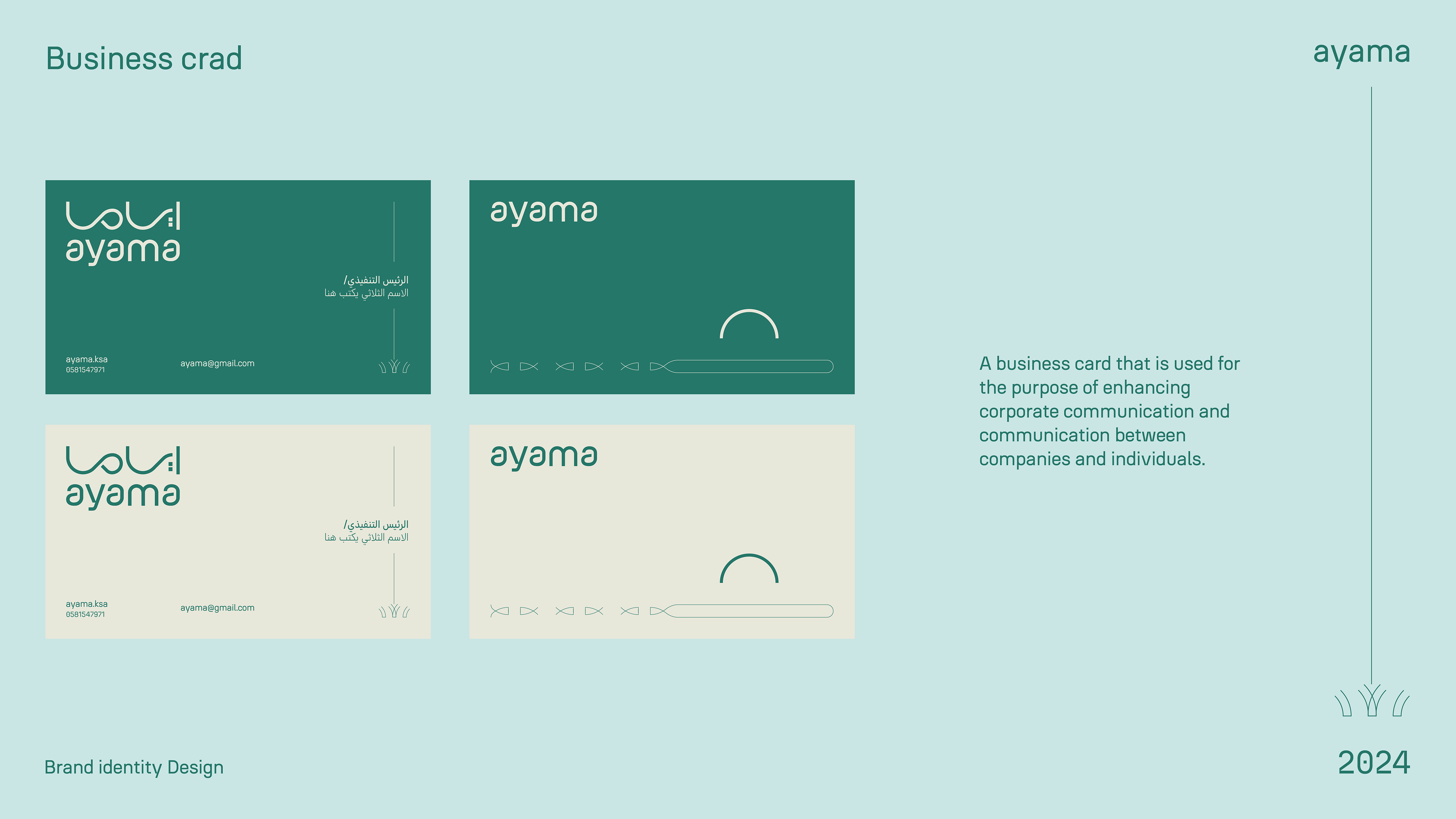
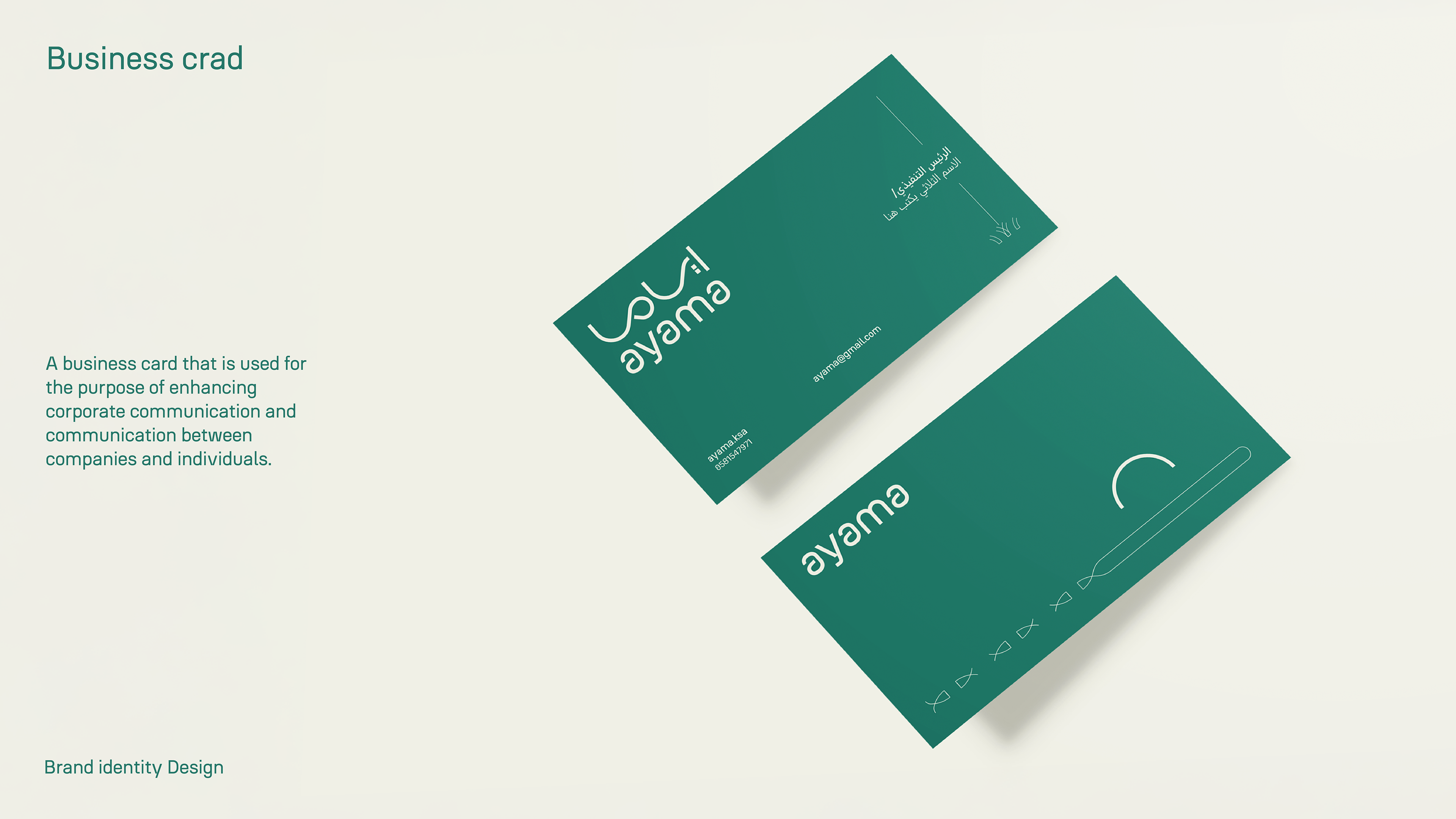
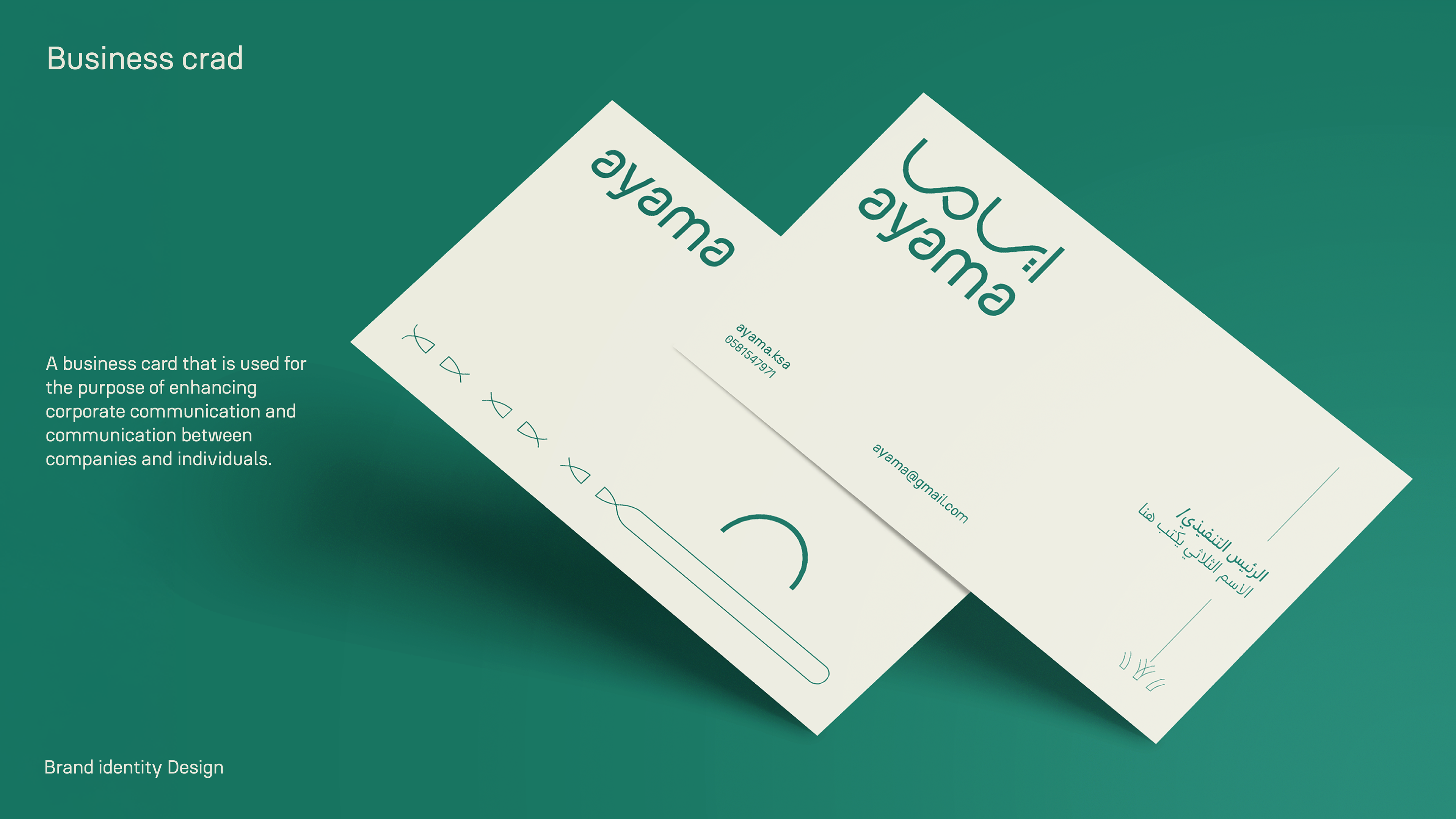
Our role in identity design:
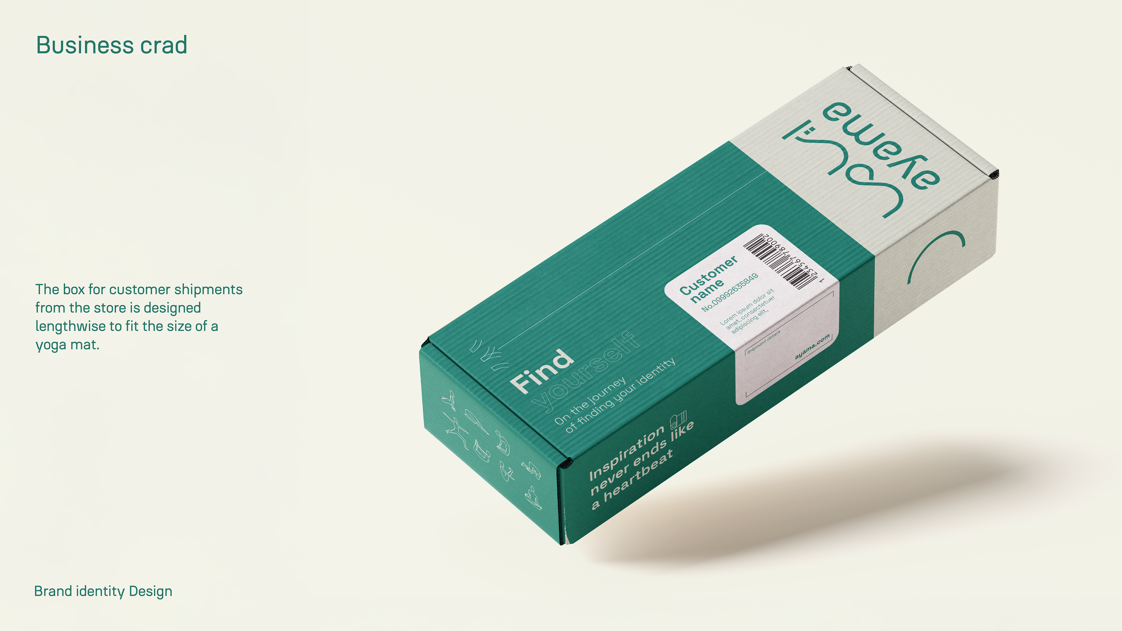
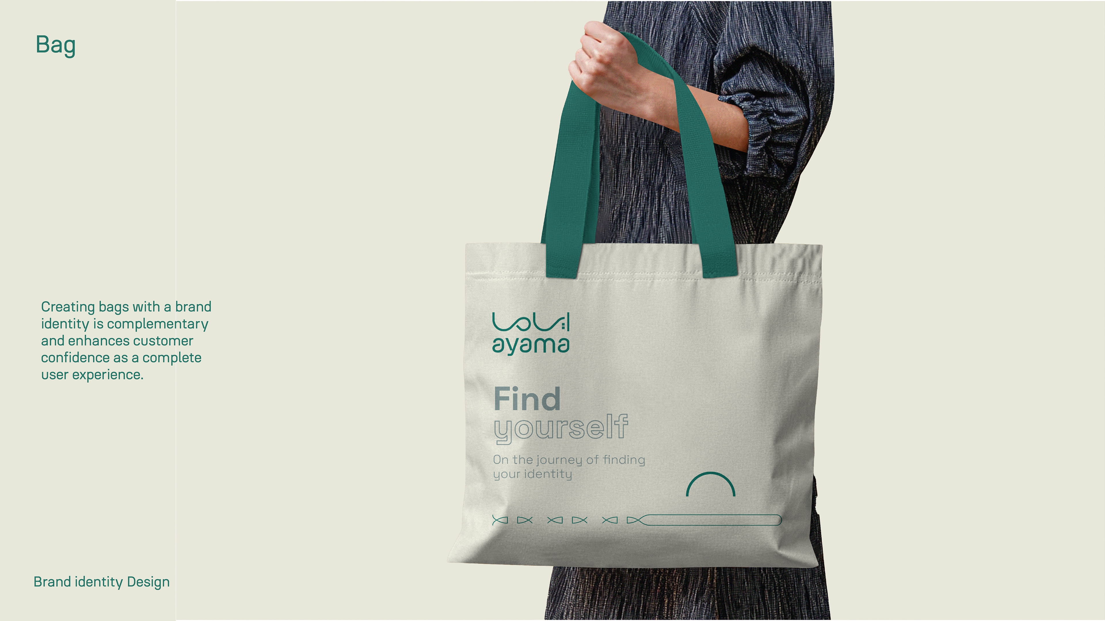
Our role was to find a visual outlet that translates what the project is and reinforces its message. Through visual identity, we sought to express the brand's orientation towards comfort and rest.
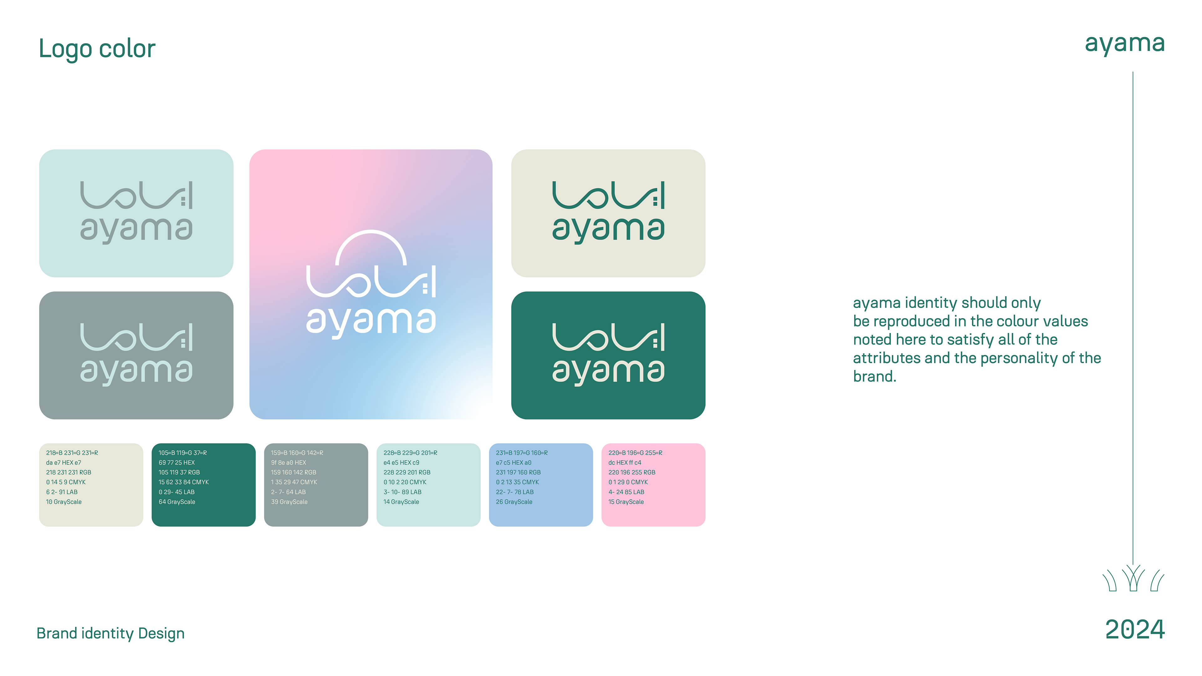
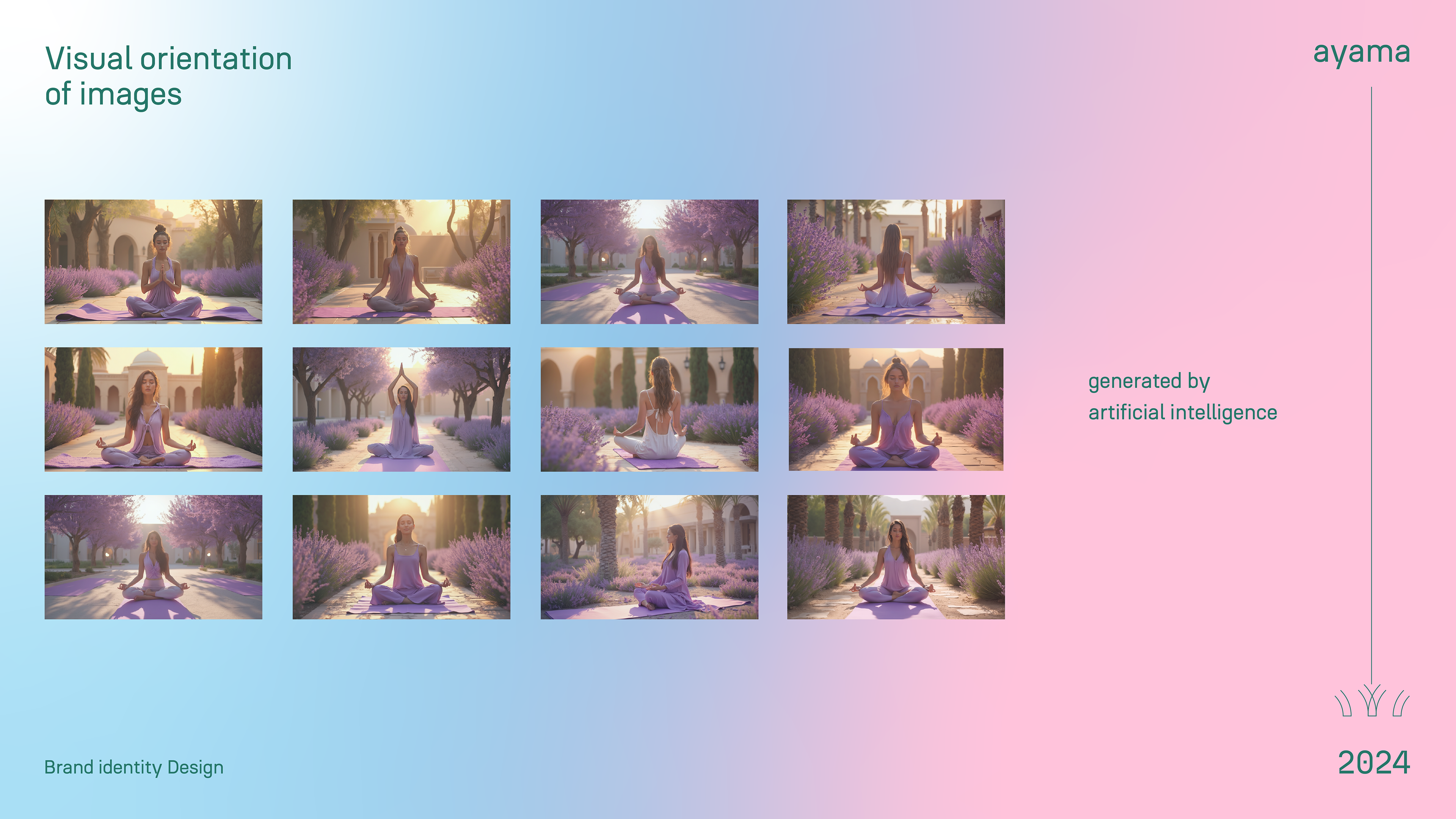
A colour and visual pattern is designed that highlights the goal of the project and solves the customer's problem in communicating his idea. The process included brand design, the selection of appropriate colours, and the application of visual orientation in printed materials and the surrounding environment.
Our vision was based on providing a visual identity that makes the customer feel comfortable and reflects the essence of the project in all its details, to be a sign that carries the message of tranquillity and balance in a world crowded with hustle and bustle.
The philosophy of the logo:
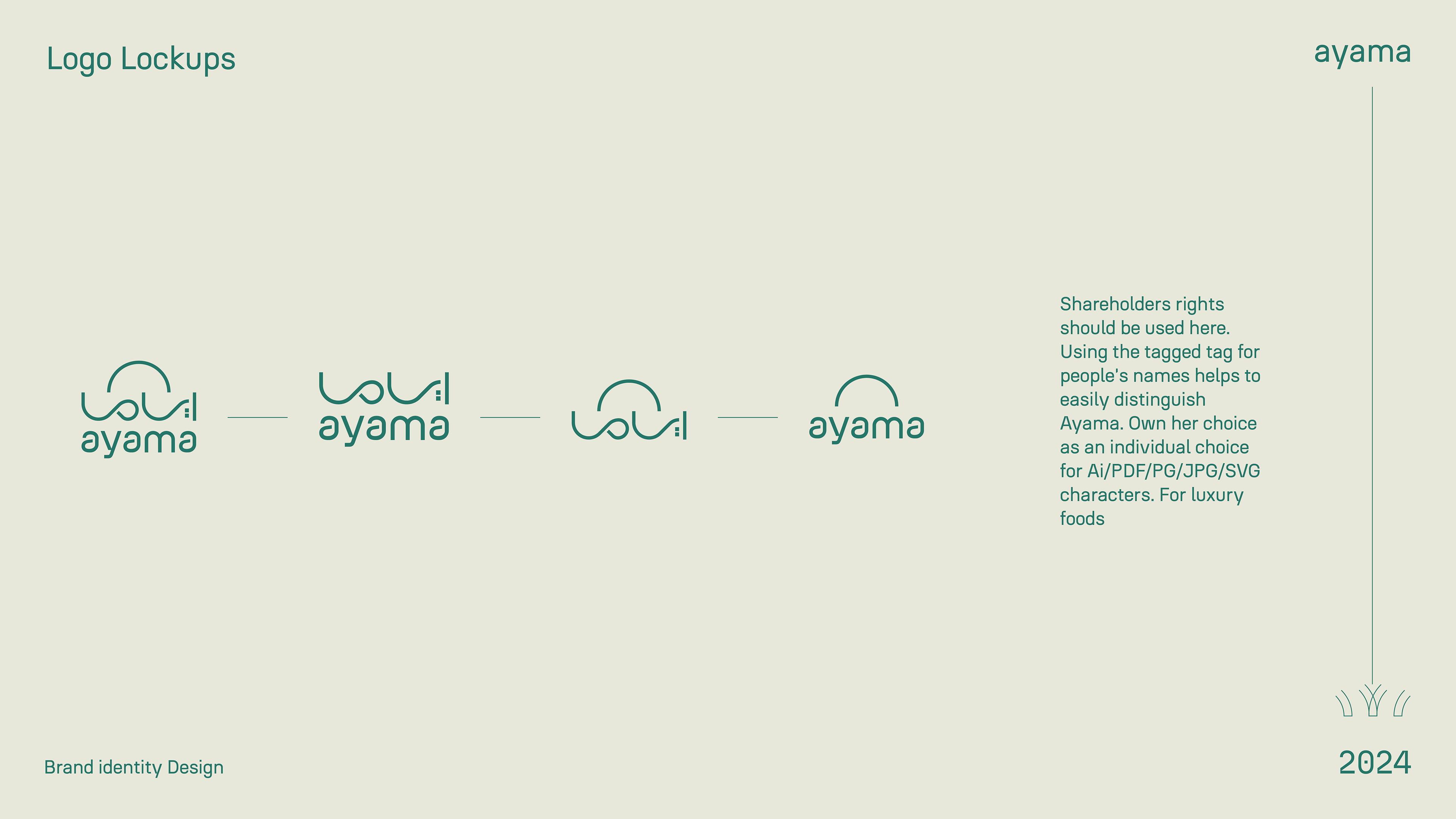
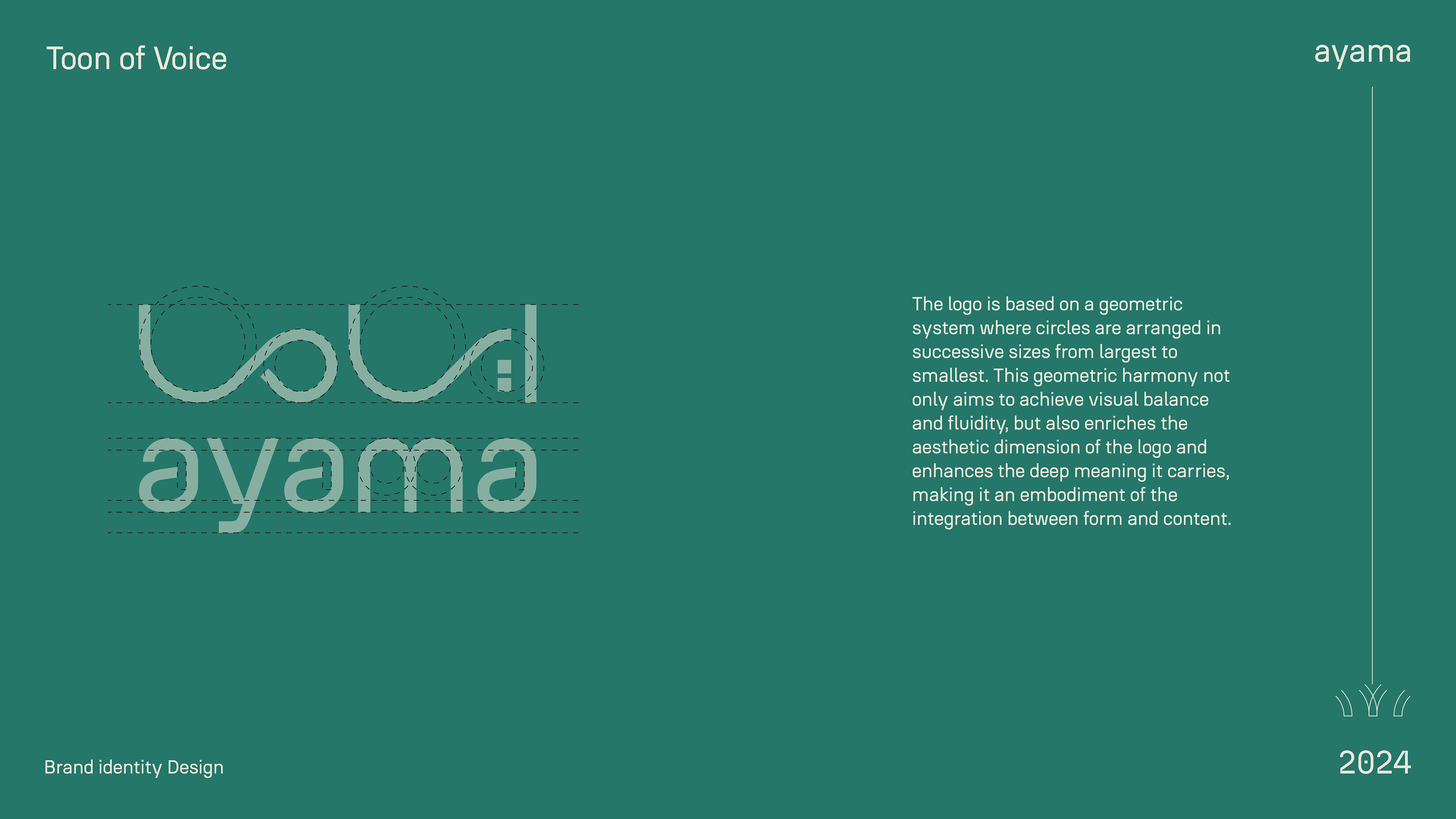
The motto is expressed in a visual language that combines four essential concepts: inner expansion, self-discovery, tranquillity, and balance.
It is brilliantly designed to blend elegance and simplicity, creating an aura of confidence and tranquillity. The slogan is not just a visual element, but a symbolic journey that embodies the ambition towards achieving balance and inner harmony. It is like a window that opens to a world of reflection and psychological peace.